CONVEIENCE STORE WOMAN
* 2024 PRODUCT DEVELOPMENT *
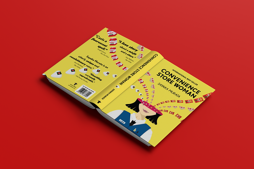
This is my take on the book cover for the book, "Convenience Store Woman," by Sayaka Murata, which is a project I made in my Packaging and Product Design class in Spring 2025.
For this assignment, my professor asked us to pick a book that we knew well, or a book that we had read and thought the cover was misleading. The original cover for "Convenience Store Woman" is very simple, with a bright blue background and a cute rice ball sitting on a bright pink napkin depicting a woman: the main character of the story. Very cute, right? This book is definitely not cute and is incredibly weird at times. It depicts the avoidance and ignorance of autism in Asia, as well as the importance of knowing your worth and what makes you happy. It is fluorescent like a convenience store and flows like blood cells, which is what I wanted to show on the cover. The
bright yellow grabs your attention, and the movement of convenience store food into the woman's head sparks curiosity, all while remaining simple and organized. To understand the deeper meaning of the cover, I highly suggest reading the book, as it is a very good read.
For developing the design, I used Adobe Illustrator for the illustrations and Adobe InDesign for the layout.